A small team refresh with a big impact.
Squids

My Role
Branding, Stylescape, Creative Direction
Project Description
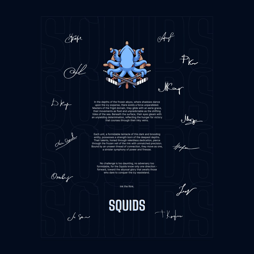
A close friend of mine is a part of a local hockey team — the Squids. He asked if I wanted to help out with updating their branding and I’m so glad I said yes. As the team continues to perform well they definitely needed a look to match the ferocity of their team spirit.
Seeing the potential.
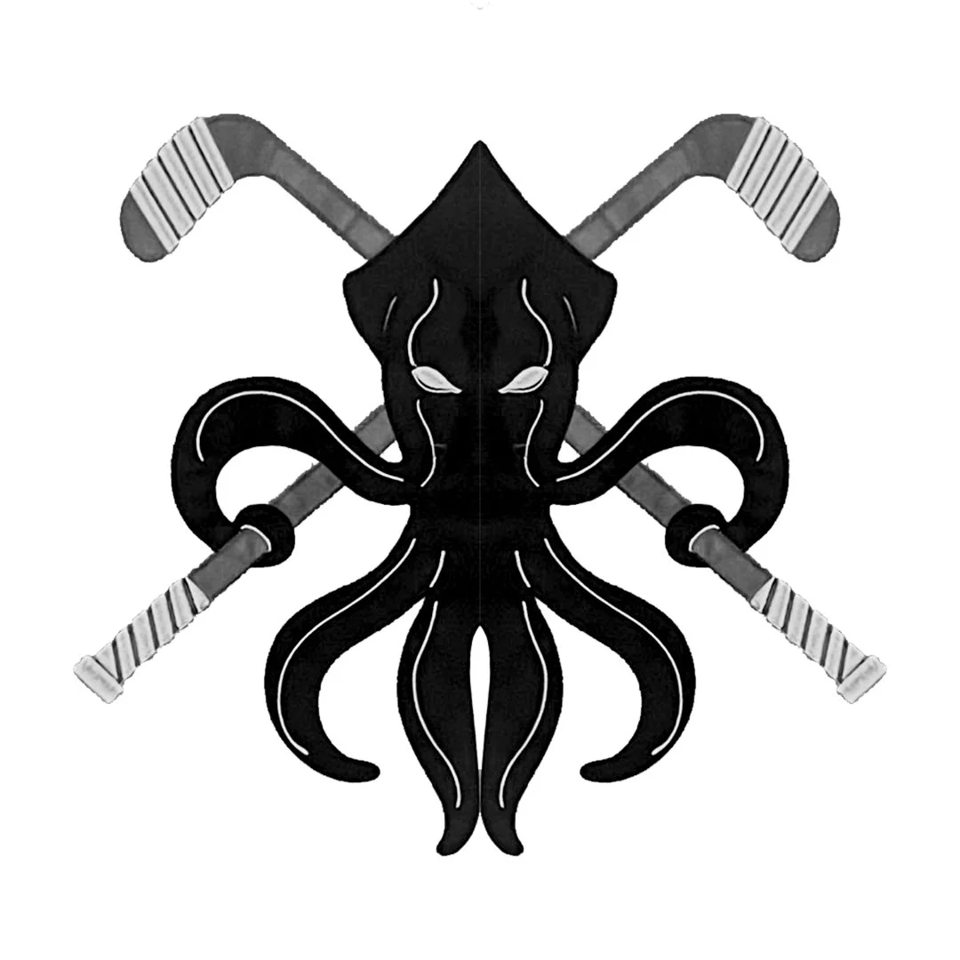
Original Logo
I loved what the original logo was trying to do, so I decided to just recompose it for better balance and bring a more classic sports logo style treatment to it to give it some depth and personality.
Logo refresh
Starting with a sketch, I iterated until the composition started to feel balanced. I liked the 20,000 leagues vibe with the ship wheel and how the legs looked when wrapped around it. Also, those little suckers. 🤌 Once that was nailed, I was ready to do my favorite thing — mockups.
In the wild.

My buddy told me that the team wanted to go darker than their current jerseys so I started with a deep blue and added tints and shades to give me some variety to play with. Ultimately, I was very happy with the results and I can’t wait to get these printed.