Bringing Forecasts to Life Through Identity, Character, and Clarity
WeatherBug

My Role
Brand Identity, Mascot Design, Visual/Verbal Systems
Overview
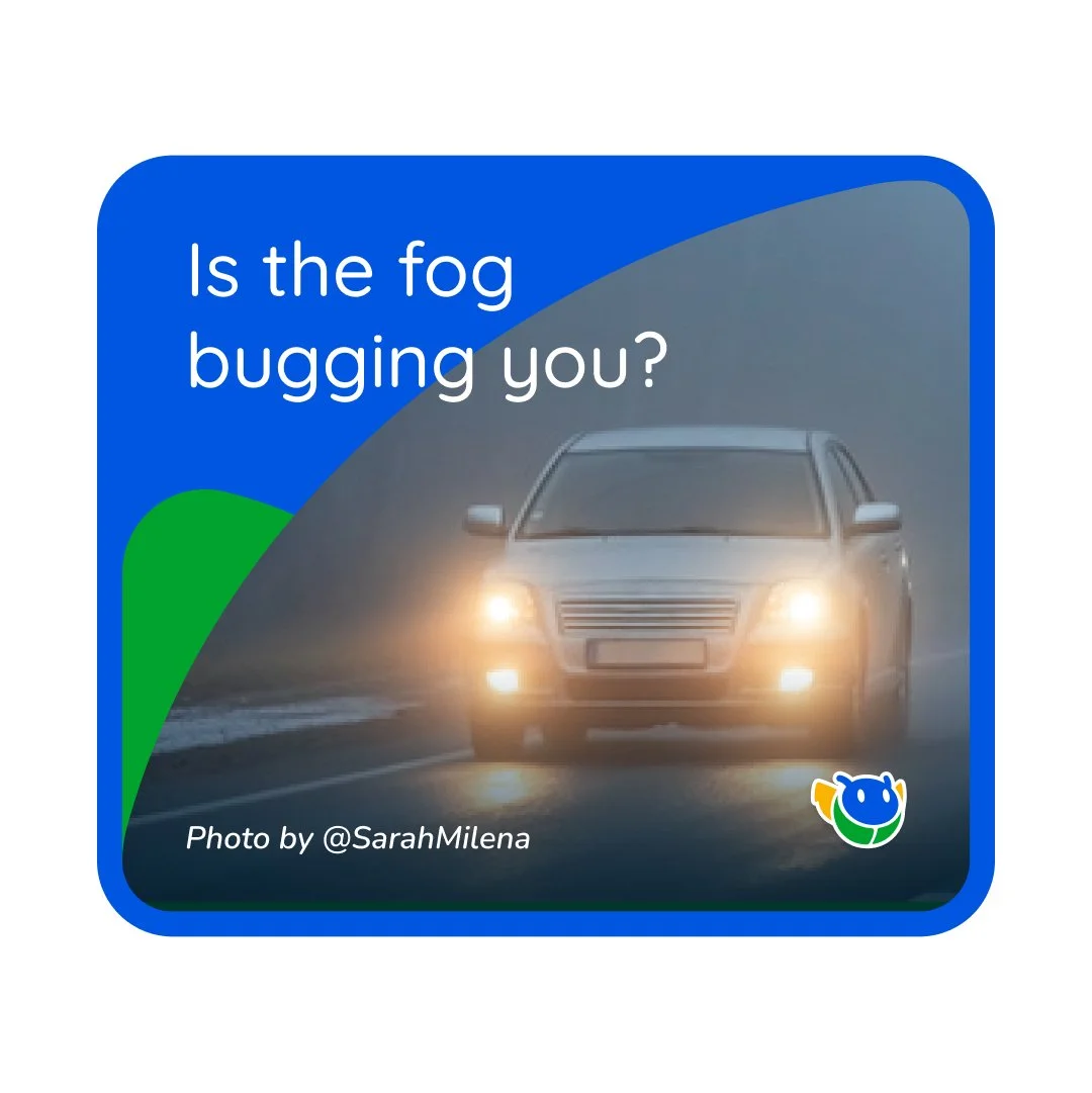
A beloved app with millions of users, WeatherBug came to us ready for a refresh. Our challenge was to modernize their brand while preserving their friendly, approachable personality. Through a thoughtful rebrand, we helped WeatherBug evolve into a visually cohesive, playful, and confident identity—one that balances function with charm across every touchpoint.
Discovery


We began by aligning with WeatherBug’s internal stakeholders to define the brand’s next chapter. The core goals quickly became clear: simplify the visual language, create consistency across digital and physical platforms, infuse the brand with more personality, and bring greater intentionality to every design decision. We also discussed how their existing character—“Sparky,” the bug mascot—could become a more central and recognizable brand asset.
To guide our creative exploration, we developed three distinct aesthetic directions. Each path explored a unique visual voice, ranging from editorial minimalism to playful motion-inspired graphics. These initial explorations provided a clear framework for discussion, allowing the WeatherBug team to pinpoint what felt right—and what didn’t—about each approach.
Concept

After selecting a direction, we focused on refining the core brand elements, beginning with the logo. A range of logo explorations helped define the personality and role of Sparky, their iconic bug mascot. We worked to modernize the mark while ensuring it retained the warmth and friendliness of the original. From stylized forms to simplified icons, each iteration brought us closer to a bug that felt both contemporary and character-driven.

With the final mark selected, we expanded the system. A comprehensive stylescape brought the new identity to life—showcasing logo applications, color palette, typography, iconography, and expressive layouts across digital and physical activations. From mobile UI mockups to tote bags and hats, we created a full ecosystem to show how WeatherBug could show up cohesively across web, social, and real-world environments. The final presentation served as both brand vision and creative proof of concept.
Execution

The final phase of the engagement was building a detailed brand guidelines document. This included everything from foundational brand elements—logo usage, color systems, and typography rules—to voice, tone, positioning, and messaging guidance. It also included direction for icon design, photography style, motion principles, and usage examples. The guidelines ensured that both internal teams and external partners could bring the WeatherBug brand to life with clarity, consistency, and intention.
Results

WeatherBug’s new identity reflects a brand that’s ready for what’s next. It’s warm but refined, characterful but professional. It simplifies and unifies the brand without losing the charm that made it popular in the first place. Most importantly, it gives the internal team a flexible, expressive foundation to evolve the brand across products, platforms, and partnerships—with Sparky leading the way.
10
Stakeholders
2
Months
54
Pages