Your local printing partner.
Gerald Printing

My Role
Light Branding, Stylescapes, Creative Direction, Logo Design
Overview
Founded in 1971, Gerald Printing has become a trusted printing partner for businesses in primarily rural areas. With their growth, they recognized the need to modernize their brand, more clearly define their services, and establish a look that conveys professionalism and trust. For this quick-turn project, Dragon Army developed simplified brand guidelines and delivered a series of stylescapes to guide Gerald Printing’s refreshed identity.

Challenges
Without established brand guidelines, Gerald Printing faced inconsistencies in color, typography, iconography, and photography. They needed a range of options from conservative to progressive to assess their direction, and we needed to ensure that any new assets were easy to replicate, given the lack of an asset repository.
Solution
We crafted three stylescapes that balanced visual consistency with varying levels of brand evolution. Each explored how to maintain Gerald Printing’s existing brand awareness while improving clarity and cohesiveness. The client chose a design closely aligned with their current branding but with a stronger emphasis on consistency and brand compliance.

This first option explored a more boutique and elegant style — focusing on print quality and sophisticated design compositions. I created a new logo to sell the vision of a more sophisticated and luxurious brand.

This second option explored a similar feel but swapped the softer blue brand color for a high contrast black. The color shift also allowed for a CMYK print process motif that included print and bleed marks.

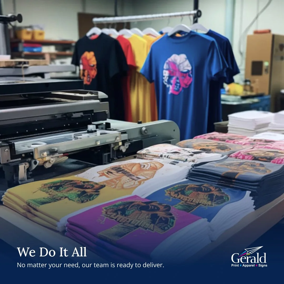
This third option kept the colors close to what currently existed, but drove more meaning and intent to how they were used by eliminating non-compliant colors and consolidating multiple tints and/or shades. The is the design that the client chose to proceed with as it felt familiar but more professional in its execution.

Delight
To enhance their brand’s versatility, we provided a set of illustration assets, enabling Gerald Printing to produce visually engaging designs without relying on photography for each piece. This gave them more flexibility and creativity in their internal design work.
Conclusion
Our work resulted in a set of consistent, easily replicable brand guidelines and a toolkit of assets that empowered Gerald Printing to produce cohesive and visually compelling content independently, solidifying their updated, professional brand presence.
3
Stylescapes
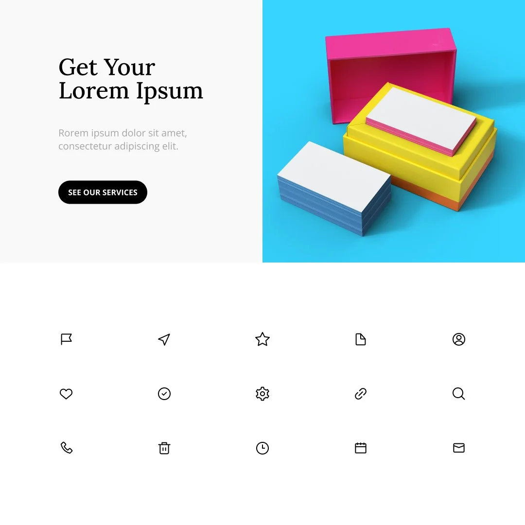
25+
Icon Assets
3
Platform Considerations