A Mission-Driven Rebrand for Community Impact
Atlanta Children’s Day Shelter
My Role
Branding, Stylescape, Creative Direction, Logo Design
Overview
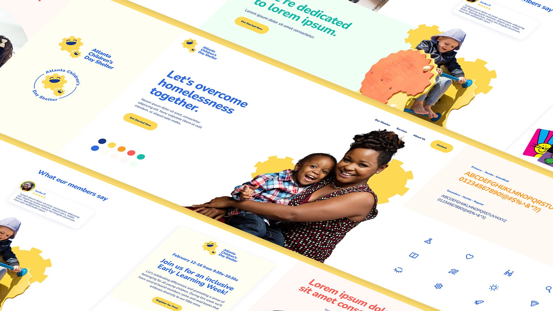
Atlanta Children’s Day Shelter (ACDS) is a nonprofit dedicated to supporting families in overcoming challenges related to homelessness, such as domestic violence and job loss. The organization approached Dragon Army to reimagine their brand, from name to visual identity, with a focus on professionalism and accessibility—all within a modest budget. Our process spanned from initial market research to delivering a new logo and stylescape, helping ACDS realize their renewed vision.
Challenges
ACDS’s previous brand presented several issues: the logo and colors lacked ADA compliance, the brand appeared outdated, and internal teams found it challenging to follow the existing guidelines. Additionally, the use of the term "Shelter" led to misinterpretations, as ACDS provides daytime support rather than overnight shelter.
Solution
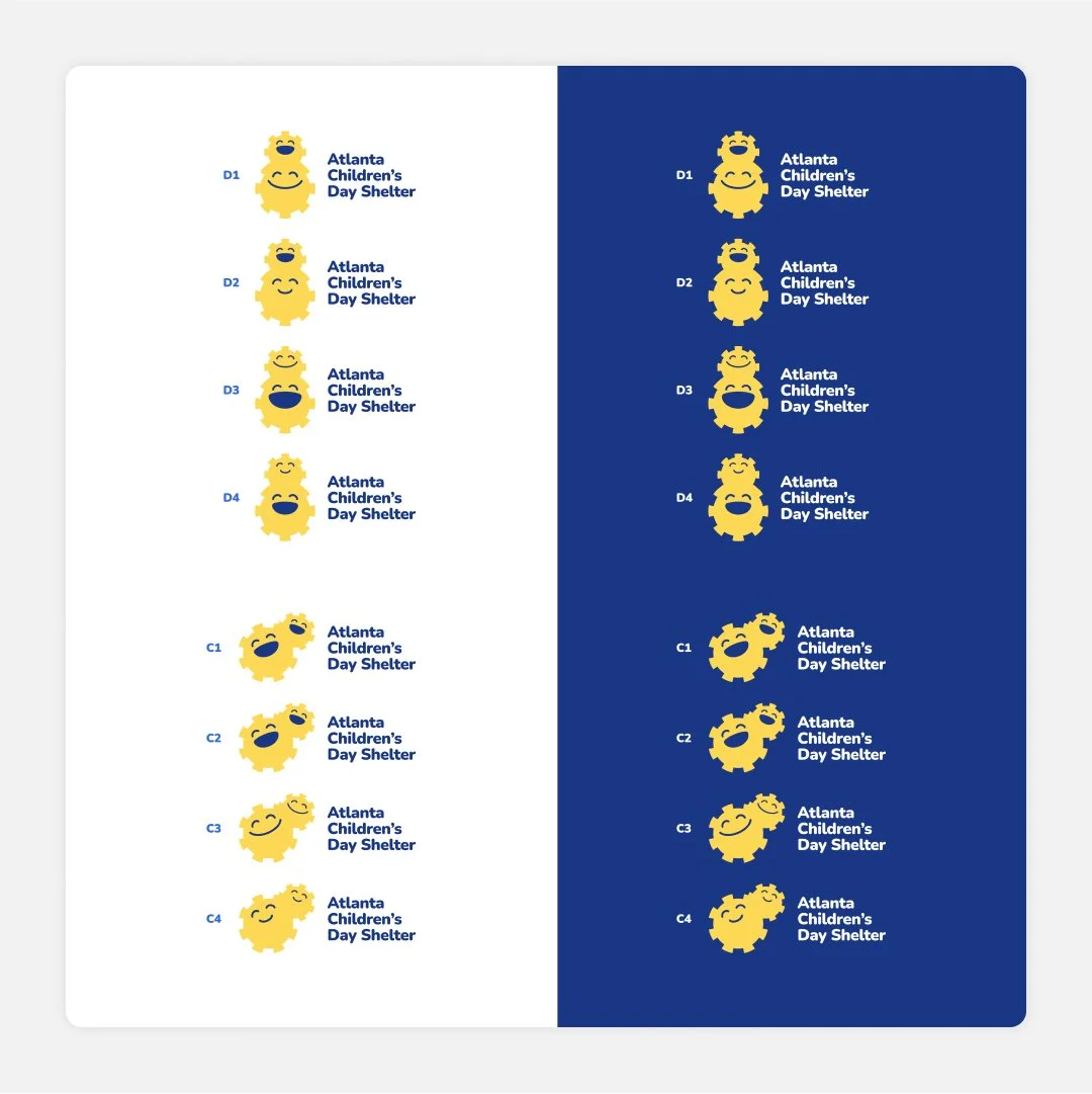
We began by modifying the name to include “Day,” clarifying that ACDS is not an overnight shelter. Next, we developed three brand directions, each aligned with different internal messaging structures. ACDS selected a child-centered approach featuring a gear motif, symbolizing the connection between children and guardians—a visual metaphor for the support and community ACDS provides.
Delight
To bring the new brand to life, we animated the gear motif, emphasizing connection points between children and their families. This versatile design system allowed for cohesive yet unique content across platforms, giving ACDS flexibility in their messaging.
Conclusion
The rebrand was a resounding success. The new identity was warmly received internally, and the local community embraced the updated design. Inspired by the transformation, ACDS is now redesigning their physical spaces with a fresh color scheme and branded materials, further embedding their renewed mission into their surroundings.
3
Aesthetic Directions
1
Stylescape
100%
Client Satisfaction


