
Grow your business.
Krystal

My Role
Creative Direction, UI Design, Team Lead, Design System
Overview
Krystal, an iconic fast-food chain serving delicious burgers since 1932, wanted to elevate its digital presence with a revamped website, Krystal.com. I led this redesign, focusing on creating a site that captures Krystal’s unique brand personality while delivering an engaging, intuitive user experience. The goal was to modernize Krystal’s digital hub, making it as consistent and reliable as the brand itself.
Awards
2020 AMY Award (Website/Web Creative)

Challenges
This redesign required reinventing Krystal’s main digital presence to align with the brand’s playful and dependable image. The site needed to provide a seamless experience for users day and night, and to handle secure gift card transactions, online ordering, and mobile-friendly navigation across hundreds of locations.

Solution
We launched a fully reimagined Krystal.com featuring an enhanced UX/UI design, responsive navigation, and robust online ordering capabilities. Starting with user-centered design principles, we implemented a localized ordering system that supported hundreds of locations and ensured that security features were built in for a safe user experience. Each element was carefully designed to keep users engaged, from streamlined navigation to dynamic, responsive layouts optimized for mobile.

Delight
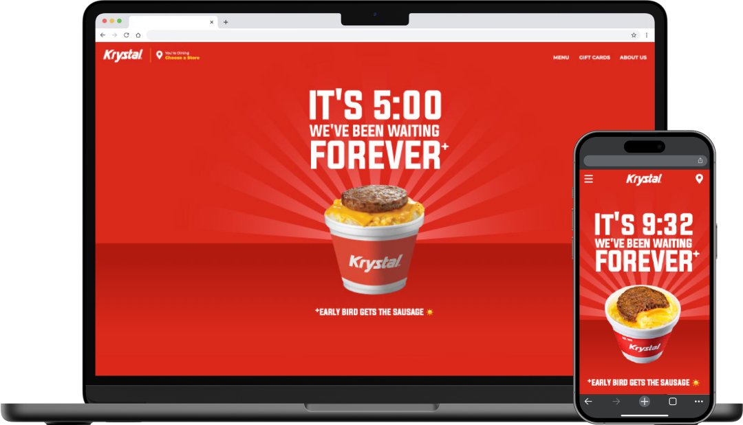
To bring a touch of fun, we infused the site with surprise elements, such as a playful design shift after 10 p.m. and hamburger confetti animations upon form submission. These interactions added a layer of delight that resonated with Krystal’s lively brand identity, creating a memorable experience that kept users engaged.
Conclusion
The Krystal website redesign received tremendous feedback, increasing organic traffic by 32% and earning an AMY Award for creativity. Additionally, accessibility improvements boosted the site’s score to 99%, solidifying Krystal’s digital presence as both welcoming and inclusive. This project highlighted the power of creative direction, UX/UI design, and strategic design systems in driving a consistent, on-brand digital experience.
+32%
Organic Traffic
99%
Accessibility Score
100%
Client Satisfaction
The experience was well received and participation has been amazing in the digital experience. Thank you all for contributing to this!
Matthew Montemaro
Vice President, Head of Production & Development @ Studio Now


