Transforming Historical Data into an Engaging Interactive Experience
AHC: Atlanta by the Numbers
My Role
Creative Direction, UX/UI Design, Design System Creation, Data Visualization, Animation
Overview
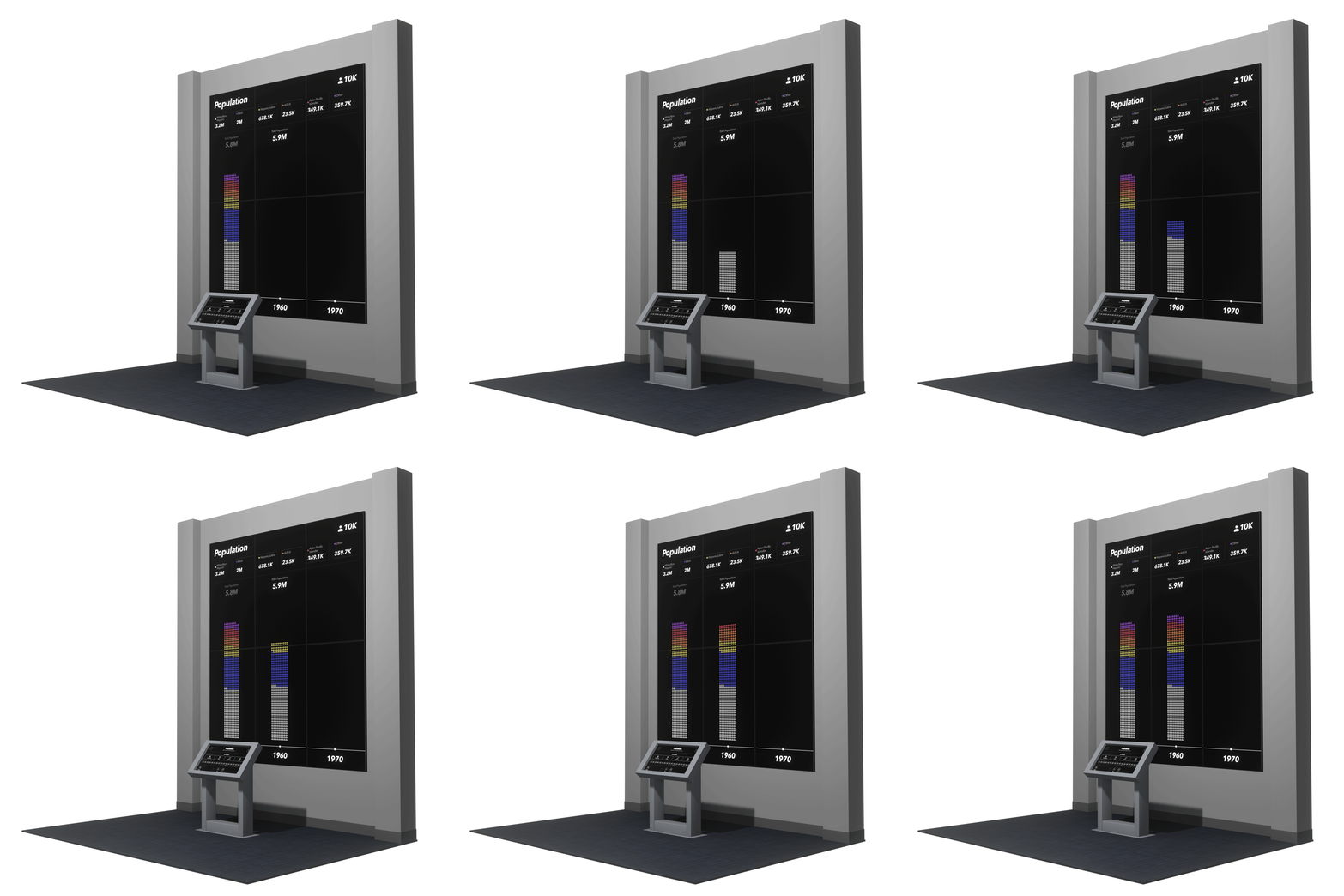
Atlanta History Center partnered with Dragon Army to transform an existing installation into a visually compelling, interactive experience. With the Atlanta Regional Commission (ARC) as a data partner, we designed Atlanta by the Numbers to showcase how the city has evolved over time. Built around a 6-panel display with a single touchscreen interface, this installation combines historical data with dynamic data visualization to engage users, making data the foundation of an immersive storytelling experience.
Challenges
Creating an engaging experience rooted in data and analytics presented several challenges. We needed to make complex datasets accessible and interactive while telling an emotional story through key metrics like population, employment, households, and income. The data from ARC contained gaps, so we optimized the design for clarity and engagement based on available information. Additionally, the display needed to be visually compelling for nearby museum-goers who might view the interaction from a distance.
Solution
Our team developed a polished, high-performance interactive experience that allowed users to explore Atlanta’s history through multiple data categories. Visitors could filter by demographic factors such as race, age, gender, family type, and industry, enabling them to see how these factors influenced Atlanta’s development over time. Timeline animations guided users through the information, smoothly introducing new data points and allowing for direct comparisons between years.
Delight
To enhance usability, we designed timeline animations that smoothly introduced new data, encouraging users to explore trends over time. Each data entry animated beside existing information, making it easy to understand year-over-year changes. The experience concluded with a summary view, providing a comprehensive comparison of Atlanta’s evolution across decades.
Conclusion
The Atlanta by the Numbers installation delivered an intuitive, engaging user experience that made historical data accessible and visually captivating. Simulating hundreds of data points across numerous categories, the interface was both responsive and informative, delivering smooth animations that elevated the user experience. This project exemplified our strengths in UX/UI design, creative direction, and data-driven digital design, turning historical data into a memorable and interactive museum experience.
160
Years of Data
10
Dynamic Filters
17
Data Groups


